Sunday, May 19, 2024


Phyllis Webster
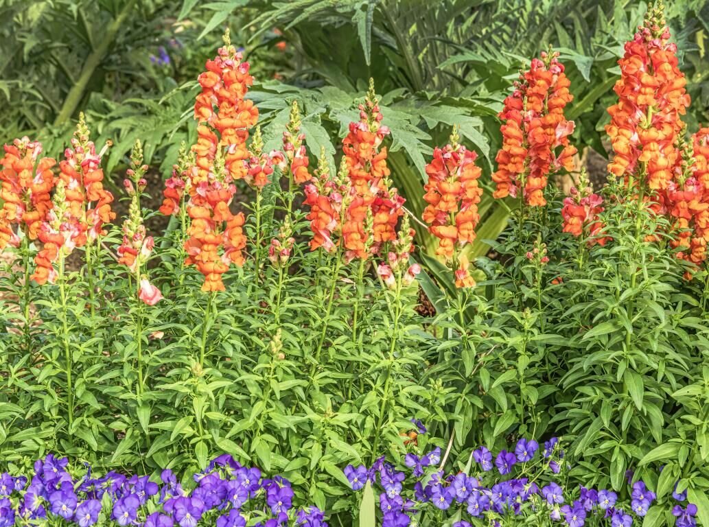
This spring planting attracts attention to the garden by using contrasting colors, texture, and plant heights.

GARDEN PATCH
Phyllis Webster earned a degree in journalism before embarking on a long career in public relations and marketing. A Granbury resident since 1998, she has been deeply involved in the community. She is an award-winning writer and photographer, as well as a Master Gardener. She has authored Garden Patch since 2001.
Far too many landscapes lack color and contrast. There is, of course, an abundance of green and brown derived from turfgrass, foliage and bark. But while functional and beautiful in their simplicity, these basic landscapes are missing the character and personality derived from a wider color palette. Color brightens, adds depth, creates interest and grabs the eye.
Homeowners can be shy about using color, often claiming a lack of artistic design abilities. Others worry their neighbors won’t approve of their choices. Never fear! The most famous gardens of the world use color to their advantage. Here’s how.
Know that colors change constantly as they are influenced by light and surroundings. For example, a color’s brightness is affected by nearby colors, particularly those that contrast. Contrasting colors are positioned opposite one another on a color wheel, as are blue and orange. An orange daylily will look particularly bright adjacent to blue flowering salvia.
Designers also use other types of contrast to build a garden’s color scheme, such as warm versus cool. Warm colors include red, orange and yellow. These hues stand out in a landscape. Cool colors include blue, green and purple. These hues recede in the landscape. Combine warm and cool to create visual variety. In a space where too much contrast creates chaos, you can give the eye a rest by incorporating areas that are “neutral,” which means using shades of white, grey, silver, tan, dark green or near-black — colors that won’t compete with your design, but rather blend the whole composition together.
Contrast is also achieved with texture. For example, mix large-leafed plants with those sporting smaller foliage or mix variegated leaves with solid green. And don’t forget shiny foliage versus dull, or spiky leaves adjacent to smooth. In many Japanese gardens, contrast is achieved through foliage texture, a mix of light-to-dark green hues and seasonal changes.
Yet another way to incorporate contrast is with varied heights. Think about the mature size of plants before purchase. Plant taller specimens in back or center of garden beds, surround them with mid-sized plants with petite plants at their base. An example is a redbud tree surrounded by dwarf yaupon holly shrubs with perennial spreading lantana around the edge. For larger landscapes, consider adding one or two more height layers. Your only restriction is space. For an even more exciting display, vary color and texture layer by layer.
Still unsure? Start with green and restrict yourself to only two other colors. Or you may limit yourself to one or two “islands” of color inside your green oasis. Within the islands, plant flowering annuals, bulbs, and perennials. Yet another idea is to create one zone within the overall space that by contrast calls attention to itself, such as a meditation garden filled with calming pastel hues surrounded by evergreens. Using color is empowering, so don’t be afraid to experiment.
For answers to your horticulture questions, please call the Texas A&M AgriLife Extension, Hood County at 817-579-3280 or go online to visit lakegranburymastergardeners.org.
pwebsterco@gmail.com | 817-680-4849


